The secret ingredient behind nice-looking UIs?
It’s not talent nor a “good eye”; the ingredient is called do-try-polish-repeat…
The more experience you have, the fewer grams of do-try-polish-repeat you need.
If something doesn’t feel right to you, it means it needs another do-try-polish-repeat cycle.
Still feels wrong, and you’re out of ideas? Don’t worry, go grab a coffee, show it to someone else… increase your inputs, move your brain to something else… It will click, slowly but surely.
I can share a personal example of this approach for the homepage of 100cims.
First iteration, borders and too many colors
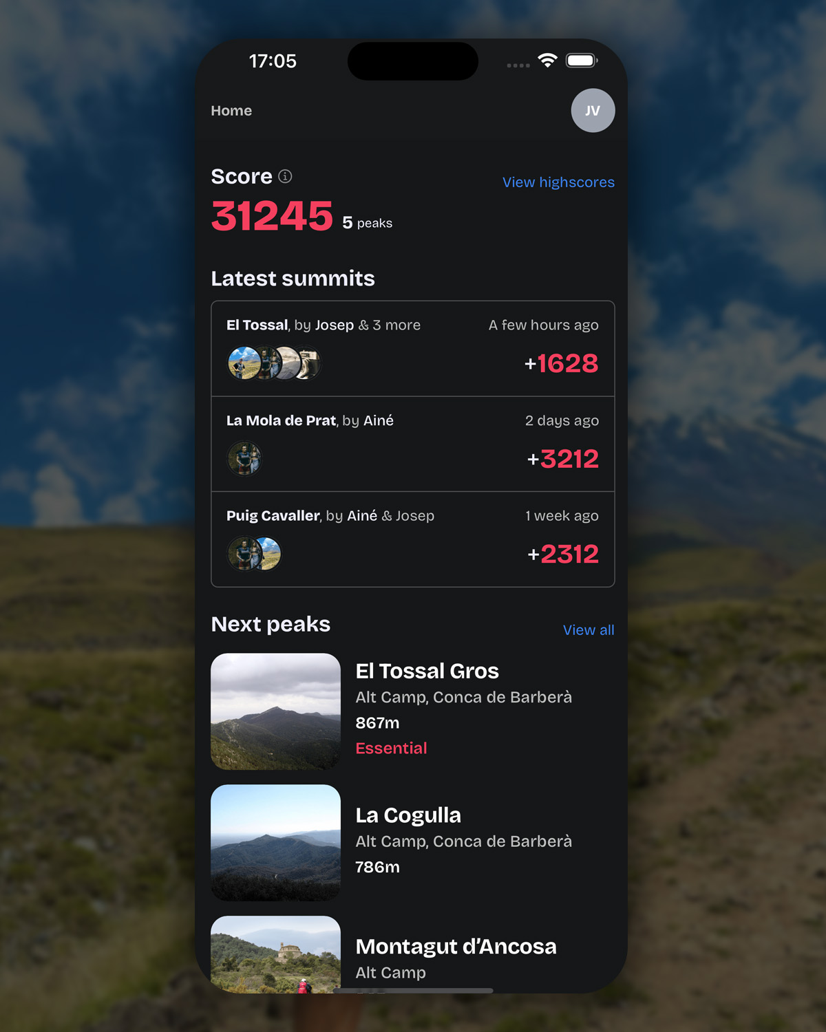
At this stage, I had a solid idea of what information I wanted to highlight on the homepage, but the overall design vibe was still not there.
- The links, I wanted to make them really visible, but the blue color was too much.
- The latest summits section, the boxed approach wasn't feeling right, borders do incur noise and the scoring number had too much weight on the page.
I was not sure how to proceed, so I continued building other pages waiting for inspiration.
Second iteration, cleanup
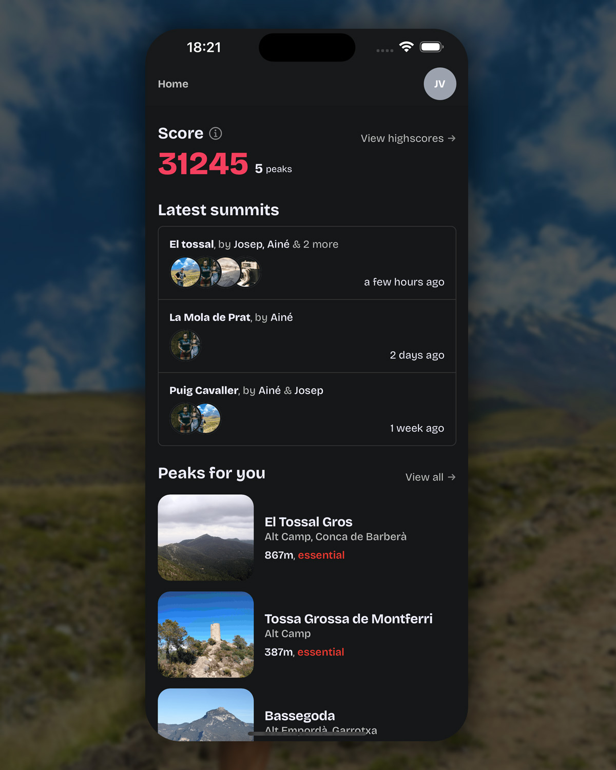
In this second iteration, I went for the areas that felt the worst:
- The links are now greyed out, with an arrow indicating that they are navigation buttons.
- The latest summits section, while still boxed, I got rid of the meaningless scoring punctuation.
Other very minor changes happened on Peaks for you section, that changed their name from Next peaks, and also the
essential tag was inlined with the height attribute.
While the interface was getting cleaner, it didn't yet feel perfect, one more iteration cycle was needed.
Third and current iteration
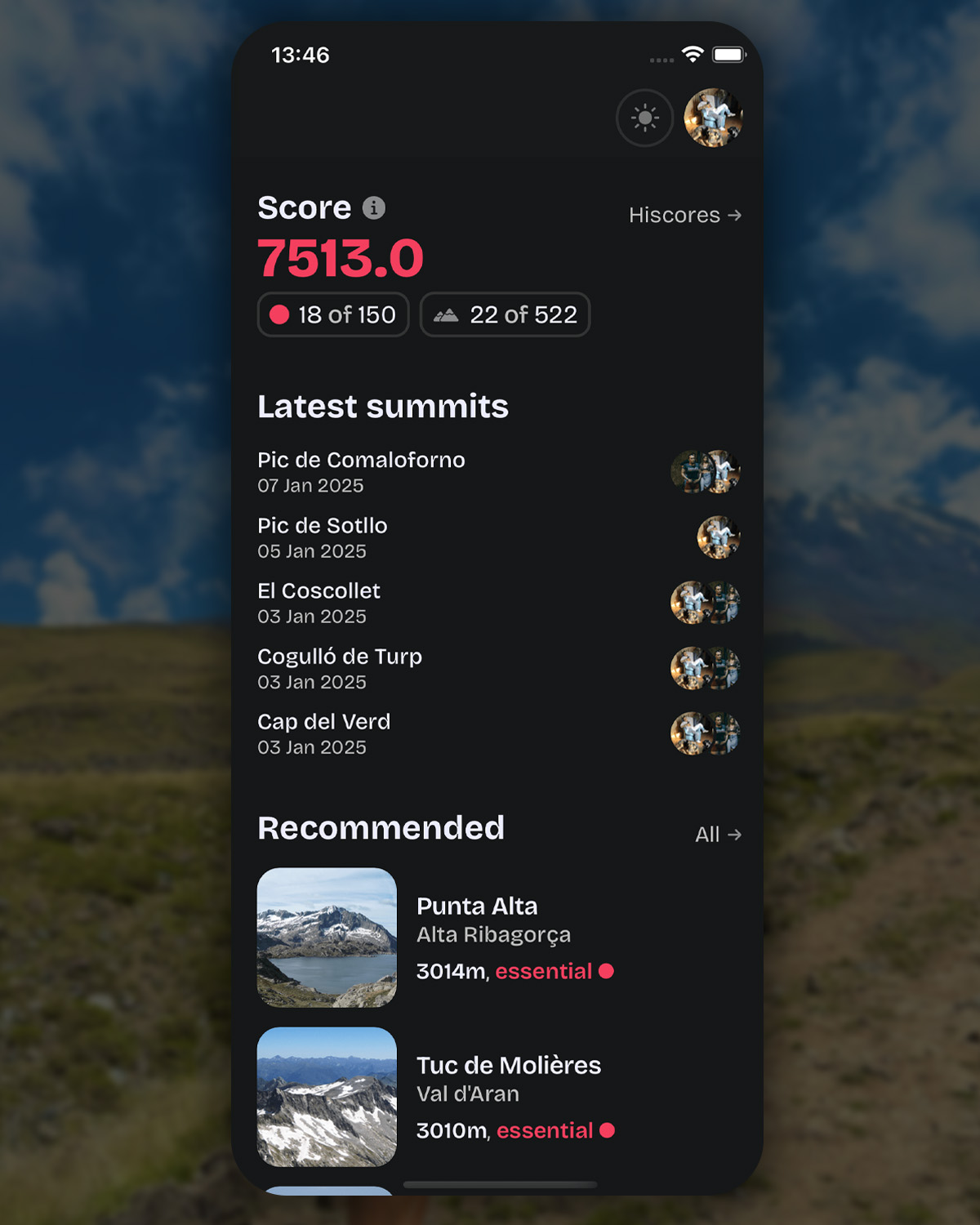
Days have passed since the previous iteration; I continued working on other parts of the app, when I came back to it, everything finally clicked:
- The score section, now has a bigger but shorter gray link, in the content, we can find a counter of the essentials peaks done, indicated by a circular sphere.
- Latest summits, got the borders and people names removed, de-clutering the section.
- Recommended, shortened the texts, reduced the image weight, and linked visually the top section with the essential tag by using the pink sphere.
On top of that, I added a dark/light button on the top bar, and while I know a click-once-and-forget button like that shouldn't be on this position is a nice filler for this app version.
Finale
Both the first and second version were already shippable but they had something off, the last version while by no means final (does that concept even exist on software?) doesn't feel off anymore.
If you want to check by yourself the home page, with smooth animations not reproducible on a blog post, visit 100cims and download the app :)